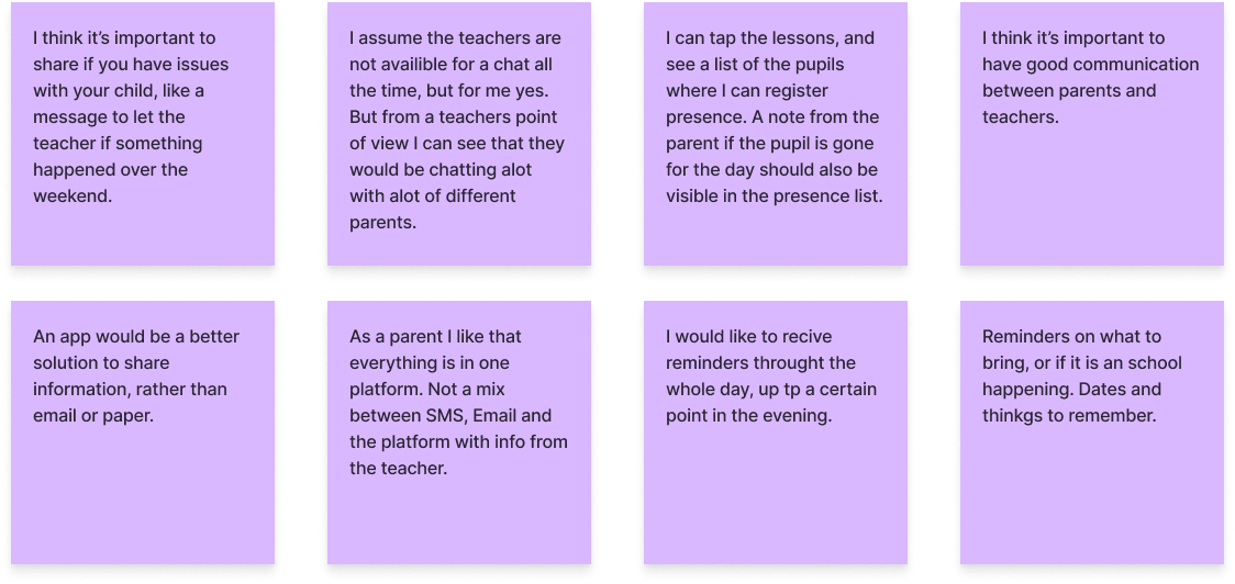
We have interviewed 5 participants. They gave us (among other things) a lot of facts about how they are currently communicating with home/school, what they like about it, don’t like about it, and how they would imagen the optimal solution to be. There were many different opinions, but all the new knowledge was really valuable for us. We also had discussions after conducting all the interviews, where we shared our new knowledge. This was very helpful when we later did the affinity mapping and needed to handle a good chunk of facts.
Survey
We have collected 31 responses through the survey and received both quantitative and qualitative data.
Highlighted data:
66,7 % of both teachers and parents think that there is a need for a platform to simplify communication between teachers and parents.
66,7 % of the parents would prefer to write/receive important information about their child with an app, but 33,3 % would also like to be able to use other features such as SMS, phone call and mail in addition to an app.
75 % of the teachers said they would prefer to write/receive important information about their students with an app, while 16,7 % would prefer communication by mail.
In general, it seems like the majority of teachers and parents like the idea of an app for school/home communication.
The majority of teachers would like to use the app during school hours, while 53,3 % of the parents would use it after school hours.
80 % of the parents and 50 % of the teachers would prefer a Mobile app for communicating with a teacher. 41,7 % of the teachers would prefer to use both a mobile app and a web browser.
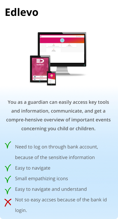
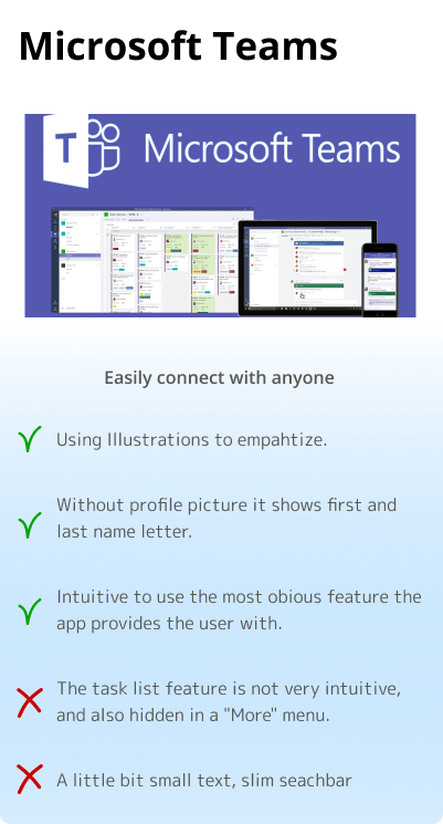
Competitive analysis
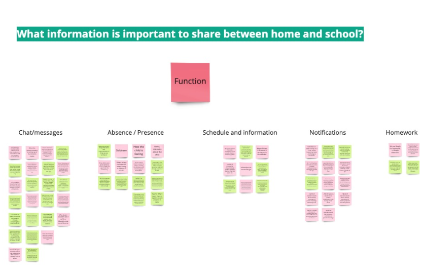
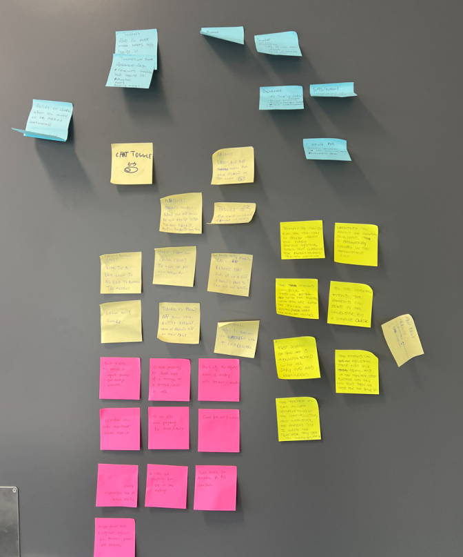
Affinity Mapping
After organizing data from the interviews and survey, we have used the affinity mapping technique. By connecting facts with similarities, we were able to organize them into groups. After creating the groups, we interpreted the facts in each group to create themes. The affinity mapping technique helped us to turn our facts into insights.
Insights
Recommendations
The majority of teachers and parents want a chat/message function.
Teachers and parents should be able to communicate through a chat function.
Teachers are afraid that with the chat function their workload will significantly increase.
A chat function should be able to turn on and off, depending on how the teacher wants the communication between them and the parent to be.
Some parents struggle to log in to school-related apps. Making messages both appear in the app and SMS, would keep the parents more up-to-date.
To make messages both appear in the app and in SMS work optimally, the SMS should encourage parents to try log into the app instead of answering by SMS.
Reporting sick leave and attendance status to teachers and parents (both ways of communication) is essential to keep both parties updated on the status of the child.
Parents and teachers want features for registering sick leave and attendance status.
Both parents and teachers would like to have easy access to all relevant student information, school information, and school happenings.
We should allow the users to have easy access to all important information.
Parents and teachers would like to get notifications with changes to the schedule, and reminders about events and messages.
The app should have important reminders for both parents and teachers.
Parents would like to easily have access to their children’s homework.
Homework should be accessible for the parents.
The teachers need to contact the parents often, and they feel that it would be easier to do so through an app.
An app would be an easy way to contact the parents.
The majority of teachers and parents want a chat/message function.
Teachers and parents should be able to communicate through a chat function.
Contact teachers would use an app for communication between school and home more often than a subject teacher.
Contact teachers would be the major target group for using the app.
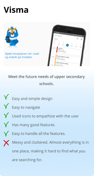
Today, apps made for communication between school and home are not optimal.
The communication app between school and home should be easy to use and understandable.
Parents and teachers prefer to use one platform to communicate and share important information about students. That platform should have an app and desktop version.
The Skooler app should include all the features that are needed for the student, teacher, and parent. The desktop app should be more built up, however, mobile app should have the most important features, that are used day to day.
Teachers and parents would like to have quick access to the most important features from the home screen.
The home screen of the app should include all the important things that are happening that day. Lessons, student lists, and access to messages.
Parents would like to receive notification 24/7 whereas teachers would want to receive it only during school time.
We should allow users to decide when they will receive notifications.
Students should have access to some conversations between teachers and parents so they feel included in what is going on with their school status.
The app should have an option for a student to access some of the features. We should allow users to decide when they will receive notifications.
Key path scenario - Parent
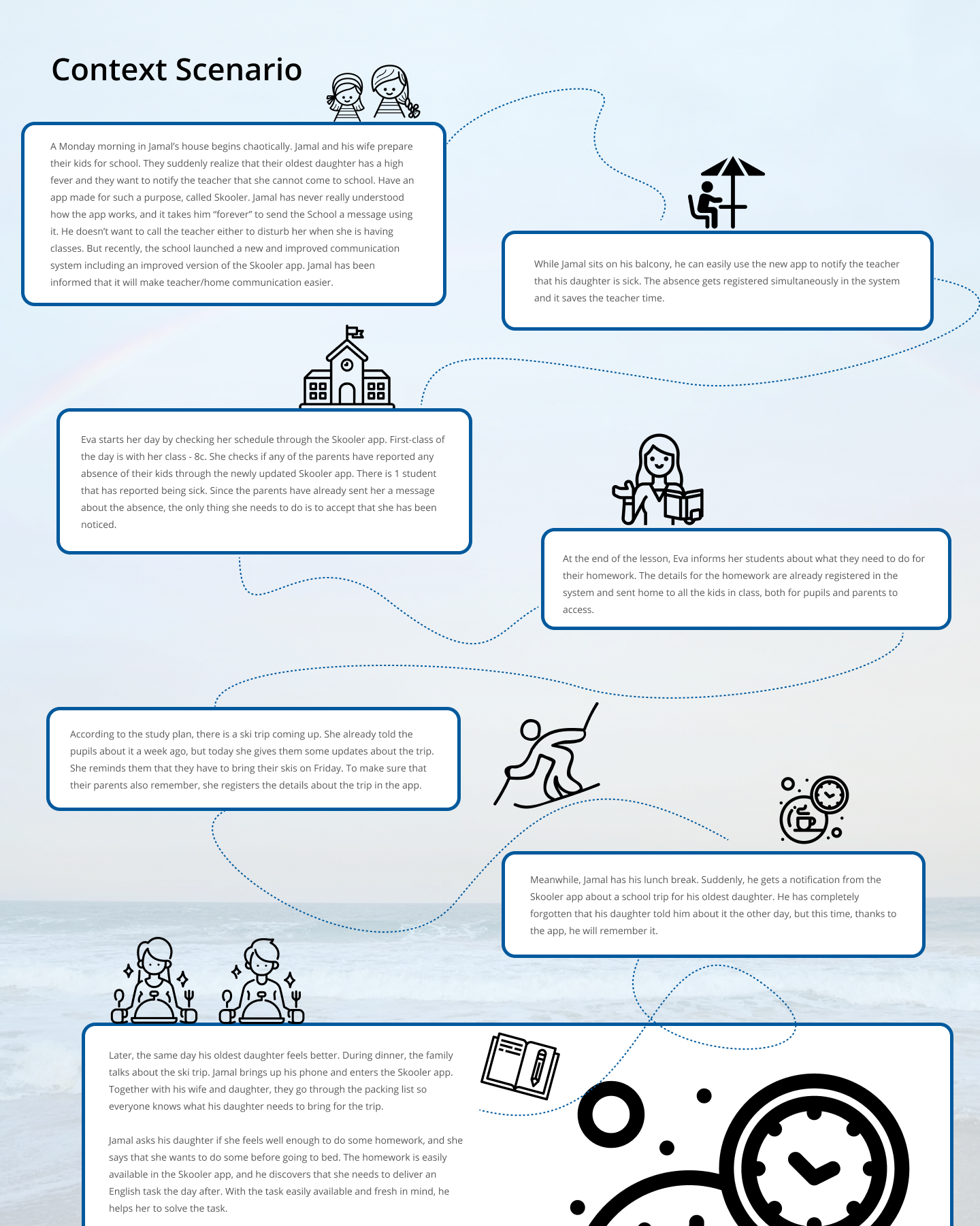
Jamal receives an email on his iPhone from school, that with a positive surprise: The Skooler app, which he has struggled to understand ever since his daughters started school, has been re-designed. The company behind the app, Conexus, promises to make School/home communication easier both for teachers and parents. Jamal follows a link attached in the email, and it sends him directly to Skooler in AppStore. He downloads the update. As a positive surprise, the app offers his preferred login method: First-time login with a bank id that allows him to make a 4-digit personal code that he can re-use for future logins.
Since his name is already connected to his kids in a secure database, the app has already added his two daughters and all the info from school that is connected to them.
At the top of the screen, he can switch between his kids so he won’t mix up info about them. Jamal starts to discover the app’s main features by picking his youngest daughter. The Home-screen provides him with the info that he until now have struggled to find in the older version of the app, such as when school is starting and ending for his daughter and the lesson plan.
In the bottom navigation bar, he can see an icon looking like an envelope, and it has a red mark on it. He taps it and discovers it is sent to a page looking like an email. He has one unopened message. The message is about an upcoming parent meeting.
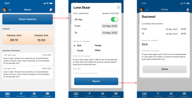
After adding the parent meeting event to his calendar, he taps the “kid switcher” in the top of the screen, and switches to his oldest daughter. He needs to report her sick and presses the absence card, which is easily available on the home screen.
During lunch, Jamal gets a notification from the app. He taps it, enters the 4 digits code, and is sent directly to a detail page in the apps calendar feature. It informs him about a ski trip that his oldest daughter needs to attend on Friday.
In the evening, Jamal asks his oldest daughter if she feels better. She says that she feels much better and that she wants to go to school tomorrow. He asks if she has some homework that needs to be delivered tomorrow, but she answers that she is not sure. She says that she doesn’t want to fall behind in progress, and wants to do some.
Before Jamal goes to sleep, he is eager to know how his youngest girl is doing at school. He worries about her a lot since she is getting bullied. He opens the app and finds the “message” feature in the bottom navigation bar. He writes a message, asking the teacher to keep an extra eye on his daughter. Since Skooler is an app made for a purpose such as this, he doesn’t get worried he will disturb the teacher’s privacy. Then he falls asleep.
Key path scenario - Teacher
Eva loves her job as a teacher, but since she started working 5 years ago, she has struggled with the school’s communication platform called Skooler. She often needs to work overtime because the app is difficult to use. When parents try to use it they don’t understand how to send her important messages through the app, so they call her instead.
Eva is checking her mail in the morning. The developers of the Skooler app have sent her a mail about the new and updated Skooler app. They claim that the re-designed app will make communication between school and home a lot easier.
After downloading it, she sees a list of login options on the screen. Her preferred login method is Face ID. The only thing she needs to do is to log in with her bank ID once to activate it, as well as allow the app to use her camera. Then next time opening the app, the only thing she needs to do is show her face.
A swipeable user manual (onboarding) is showing her pictures and uses easily understandable language, to make her understand how all the main features in the app are working.
Before the first class starts, she takes a quick look at the home screen. It shows her when classes start and end, what subject belongs to each class, and with what class she is teaching.
When Eva is attending her first class she opens up the Skooler app and easily finds the attendance list by clicking on the schedule card located on the home screen. On top of the absence list, she can see that there is one pupil that is reported sick that day. She clicks on the reported sick notice and approves that she has received the information.
At the end of Eva’s day she sits down and uploads this week’s homework for her pupils. She does this by clicking the homework from the navigation bar and then the “add new homework” button. After she has uploaded the new homework, all of her students and their parents have access to the homework for the whole week.
After updating this week’s homework, she also uploads a reminder to the parents about the upcoming ski trip on Friday. She goes to the calendar in the bottom navigation bar and presses “add new”, making her add all necessary information about the ski trip as title, date, time, and description of the trip. She can see that the newly added ski trip is now located as a reminder on the home screen as well since the ski trip is in the same week.
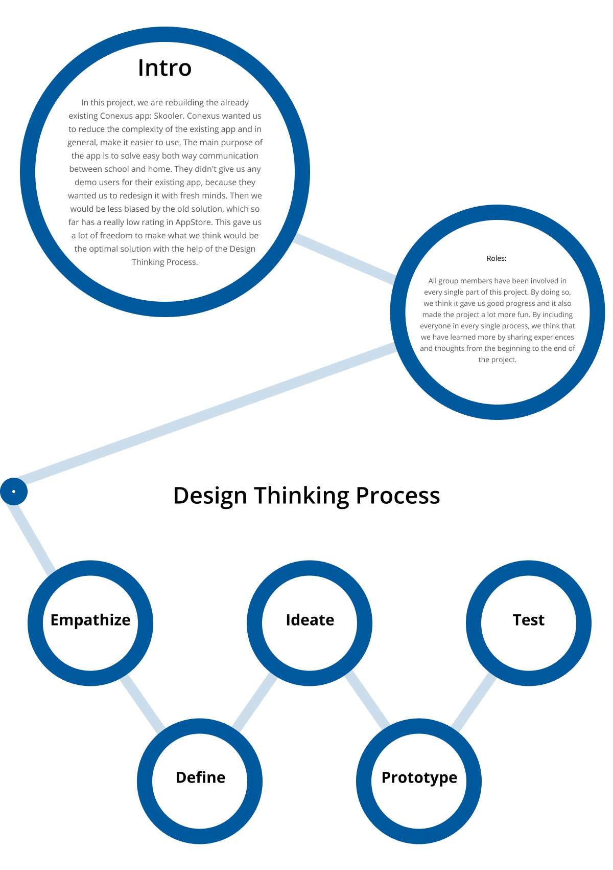
4W's
We used the 4W’s technique to focus on the users’ needs and pain points. By answering Who, What, Where, and Why, it became easier to make a good problem statement.
Who is experiencing the problem?
Teachers and parents using the already existing School/home communication app: Skooler (by Conexus).
What is the problem?
The existing Skooler app is too complicated and tries to solve too many problems at once.
Where does the problem present itself?
Everywhere during the day, when teachers and parents communicate through the Skooler app about their pupils/kids.
Why does it matter?
It matters because good communication between school and home is important.
Offering a faster and more intuitive solution will reduce the time it takes for a message to reach the receiver. It will also make it less likely that Teachers and parents forget important information regarding their pupils/kids.
Problem Statement
Teachers and parents struggle to communicate because the school’s communication platform Skooler is too complicated.
If we could provide them with a faster and more user-friendly solution, it would positively impact teachers’ and parents’ lives, because it would increase the efficiency of communication between home and school.
How Might We...
…make it easy for teachers and parents to communicate?
…make it easy for teachers to interact with the attendance list?
…make it easier for parents to register absence for their kids?
…help parents to remember school-related events?
…unite all the necessary school/home communication features that teachers and parents are using today?
…include students in the teacher/parent communication?
Ideation and workshop
We have planned and organized a workshop to generate as many ideas as possible. We used two ideation techniques – brainstorming and sketch storming.
Everyone met in the client’s office. First, we presented the research we had done so far to one of the UX Designers from Conexus. Before the meeting, the Conexus Designer had agreed on participating in an ideation workshop together with us.
The facilitator opened the workshop with an introduction to the topic. After an icebreaker activity, the facilitator framed the problem by presenting the problem statement and How Might We questions. We had them visible throughout the workshop on a presentation screen in the meeting room. By doing so, we had it available all the time when we generated ideas.
Brainstorming
First, we spent 15 min writing ideas on sticky notes individually. During that time, we were able to generate a good chunk of ideas. When the time ran out, we presented the ideas on a board, one by one.
The next step did not turn out exactly as we thought. In advance, we had planned to pick the best ideas after the brainstorming presentation to work on further. When all the ideas were presented we did not want to choose the best idea yet. We felt that there were a lot of similarities between everyone’s ideas, and it felt like it all had the potential to work as inspiration for the following ideation method: Sketch storming.
Sketchstorming
By looking at the sticky notes on the board, and having the ideas from the brainstorming session fresh in mind, the facilitator started the second part of the workshop – sketch storming. This ideation method was all about making fast sketches in a short amount of time to visualize the early-stage ideas that we already had talked about during the brainstorming session. We did 3 sessions, where each lasted for 5 minutes. All participants could make as many sketches as they wanted during this short amount of time. When we were finished, everyone presented their sketches. Next, we conducted dot voting to highlight the most interesting sketches.
After the ideation workshop was conducted, everyone had a much more clear understanding of how an app could solve communication between school and home.
The Idea
A re-invented app that makes life easier for teachers and parents, by simplifying communication between school and home.
The new Skooler app will be divided into two versions: Teacher view Parent view
Each version will have easy access to the following main features:
Home screen (Showing schedule, register absence, notifications, and important messages) Calendar (Showing events, meetings etc.) Homework Messages
The difference between the two versions is all about how much access each part has to the features, depending on their needs.
The teacher version focuses on taking care of all pupils and communicating to parents what’s going on in school, while the parent version is only focusing on the parents’ own kids.
Vision Statement
The Skooler app is offering teachers and parents the easiest and most intuitive platform for communication regarding pupils’ performance and well-being at school. The app will only consist of functions that satisfy the most desired needs of the target group, based on research. It will be easy to navigate and will help both parents and teachers to follow up with pupils in an organized and pleasing way.
Information
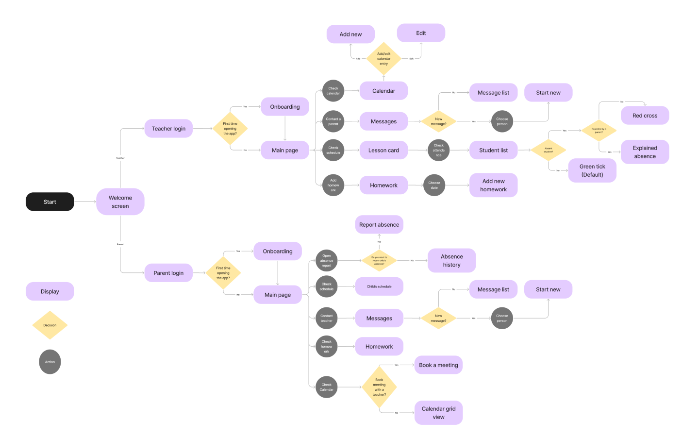
Architecture
(Parents)
Information
Architecture
(Teachers)
User Flow
Sketching
After conducting the Sketchstorming session, we started to get a clearer picture on how we should continue building the new Skooler app.
We decided to have a second sketching session but had the sketches from the Sketchstorming session to look at this time when drawing. All the group members presented their sketches and discussed them. We used Fig Jam for this purpose, which is a perfect collaborative tool for sketching. It allowed us to draw on each other’s drawings to explain what we liked, wanted to improve and what we thought should be removed.
Wireframes
Based on the sketches, we have built low fidelity wireframes. We needed to include some text within the app for the testing purposes. Creating wireframes in Figma allowed us to create an online prototype which could be used in remote usability testing.
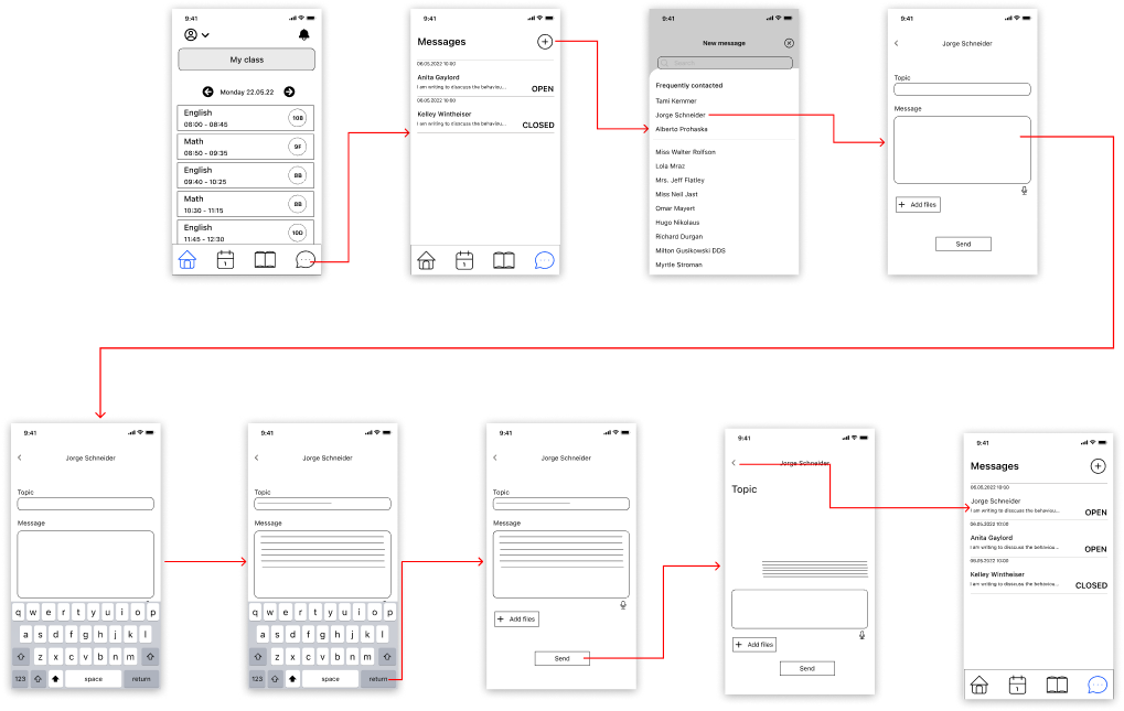
Wireflow 1 (Teacher)
Existing user
Task: Approve pending absency of a student.
Wireflow 2 (Teacher)
Existing user
Task: Add absency of a student manually.
Wireflow 3 (Teacher)
Existing user
Task: Send message to a paret of one of your student.
Wireflow 4 (Parent )
Existing user
Task: Report absency of the child.
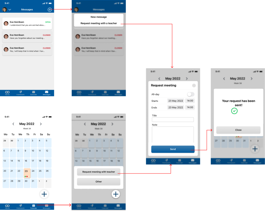
Wireflow 5 (Parent )
Existing user
Task: Request meeting with a teacher.
After building the low-fidelity wireframes and wire flows, we conducted usability testing of the Skooler App. We decided to test five user flows and we have found some interesting pain points that can improve the app in higher fidelity. We have made The Skooler App in Figma and created a prototype of low fidelity wireframes. We have also gathered all documents from the testing and preparation in one folder.
Scope
We are testing the concept design of the Skooler app. We are conducting usability testing to get feedback on the functionality and the general look of the app from the potential users. We hope to find ways to improve the app by getting insight from the users by listening to their opinions and watching their interactions.
Goal
The goal is to test if the concept of the Skooler app is correct with the user’s expectations and if there are any usability issues. We want to check if there are any frustration points in the flow.
The goal is to test if the users have issues using the re-designed Skooler App.
Key Findings
Date and time
Date range and time is confusing, participants didn’t understand what to tap to change it.
Date doesn’t look like a button and participants don’t know that they should press it.
The toggle for All day is not related to the date.
There was no start/end information.
Notifications
It was confusing to know where to find the request meeting with teachers. Most of our users went straight to the messages function.
The calendar was verry confusing for many of our test participants, making them with uncompleted tasks. Participant was looking for parent contact information.
Confusing
Participant expected to set time on notifications.
Participants was looking for notifications on Homework page.
When participants were told to confirm absence they went to notifications first.
UI issues
Participants didn’t understand the Homework icon. One of the participants didn’t understand the layout of Home page (Parent)
High fidelity prototype
After conducting the first found of testing we went back to the low fidelity wireframes and considering the key findings from usability testing we have created a higher fidelity prototype.
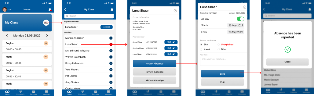
Wireflow 1 (Teacher)
Existing user
Task: Approve pending absence of a student.
Wireflow 2 (Teacher)
Existing user
Task: Add absence of a student manually.
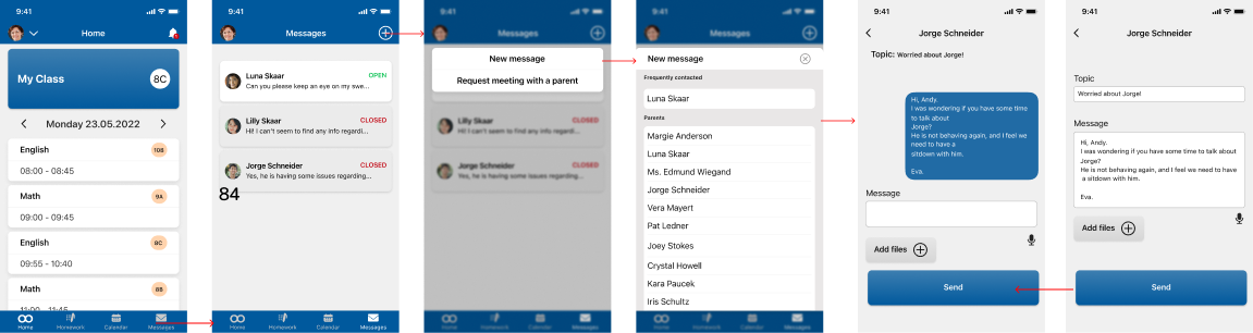
Wireflow 3 (Teacher)
Existing user
Task: Send message to a paret of one of your student.
Wireflow 4 (Parent )
Existing user
Task: Report absency of the child.
Wireflow 5 (Parent )
Existing user
Task: Request meeting with a teacher.
After building the high-fidelity wireframes and wire flows, we conducted our 2nd usability testing of the Skooler App. We decided to test the same five user flows after improving them from the last usability test. We have made The Skooler App in Figma and created a prototype of high fidelity wireframes. We have also gathered all documents from the testing and preparation in one folder. In the second round of testing, we are going to use the same tasks as the first test, because we want see if the changes will improve the usability of the app.
Scope
We are conducting a second round of testing of the Skooler app. This time we are testing high fidelity version of the app. We hope to find ways to improve the app by getting insight from the users by listening to their opinions and watching their interactions.
Goal
The goal is to test if the users have issues using the re-designed Skooler App.
Key Findings
Next steps
Update the requirement sheet.
Presenting findings to Conexus, getting their opinions, and discussing what will be next.
Taking into consideration Usability Test results and further iterations on the design.
Running third round of testing using a physical phone instead of a browser. Interacting with a phone might show us different usability issues.